
Chase app
Empower officers to deliver
a quality service to all our customers.

The vision
Empower officers, and facilitate effective and efficient job execution, data capture and clear report.
Business
- Provide a tools that allows Officers to they jobs easy to follow, accurately.
- Help the Hub team, reduce the time on managing the Job allocations process
- App adoption across all the network
Tech
- Build a robust and scalable solution that support multiple devices
- Design an officer friendly app that supports them to do their job fast and easily specially when weather hazards
- Make an app easy to use and accessible
Customer service
- Clients to receive a fast confirmation on jobs and completion within time
- Clients to clear reporting when a job has completed
Timeline
It has been a good step forward to digitise this space enabling new business and improving customer success.
however the user ' Officers' we not part of the solution and can be reflected on performance and the app UX/UI
making it really hard to use in real time.
Understanding the problems

Background
9 years ago
Officers were using manual or paper work to complete large heavy books to ensure that all work information was recorded.
8 years ago Chase app 1 was born
The goal was to digitise, simplify how officers captured the details of those jobs, and produce better, more detailed and accurate reports.
6 month ago Chase app 2 was updated
The update of the Chase application to support IOS was carried out It was a necessary step to allow for new services such as Guarding.
However, the Chase 2 UX/UI application has changed as a result of the upgrade, which may impact officer, team leader and department-wide duties. This is based on feedback from the Operations team through evidence and analytics collected based on the job tracking outside the app.

Discovery
User research objectives
A relationship and presence at the officers location was important in order to set cooperation, empathy and more important understanding of the impact the new app, i took the initiative to spend one day a week at the Officers office to observe, interview and capture as much possible the day to day of our app users below i have listed the areas i was interested:
-
Understand our audience needs, mental models and behaviour
-
Identify Officers pain points
-
Optimise app and services journeys where possible
-
Set the tone for the app - with Marketing
-
Understand business impact
Observation
Constructive
-
Mental block, resistance to change or use the new app as there are areas that cause them some friction / stress such as the interactions, (tap to open windows than slide) this seem painful when on raining conditions
-
Frustration for not being part of the solution
-
Switching from the app to maps is lots of mental load
Positive
-
Great attitude and desire to be part of the solution

The challenges

Product vision and solution

Ideation - Job acceptance job
My goal was to build a relationship with the Officers to ensure they are at the center of our solution, this was done by working closely with them and collecting feedback once a week at their office. I worked in new designs improvements to ensure they new about it and see if this was much easier to interact with.
-
With the user at the centre, and based on the initial research I focused on the pain points, behaviours, mental models, motivations and needs. i was essential that they feel the app bring value to their job by making it a lot simpler specially when in critical conditions such a weather hazards.
-
I reviewed the tone and information architecture to make sure the relevant information was displayed when needed such as:
Basic job details
Location view of the map
Provide details and actions to help accept the job
Improve the details navigation
-
I attended to their office 1 a week so they felt considered and included in our solutions, this remains a huge barrier as no much empathy is shown to the officers.
-
Simplification of user flows, no all the solutions needed to be addressed on the app, some could be backend or process even business rules and communication
-
Break down the app into user flows to have better visibility and understanding of the output
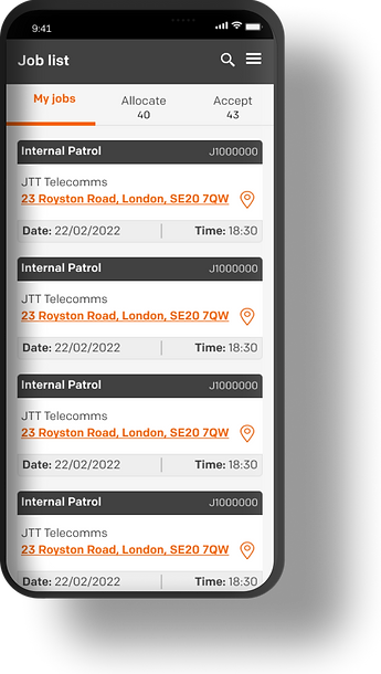
Start of a job
Currently
-
2 lists allocated and unallocated
-
The cards has a lot of information and no order
-
There is no like to take the user to an address / map location option
Proposed
-
3 list have been created depending on the type of user My list, Allocate, Accept
-
A new list has been added 'Accept' (this is a separate project)
-
Added a counter to help Officers see their workload and act accordingly
-
Having the card redesigned we could give hierarchy to the information to help the officer identify faster what is important.
-
Having the cards less cluttered will allow the user to focus on the instruction.
The card displays three important section
-
The type of service and ID number this is used in case of job reference request
-
Client name
-
Location, property number and postcode as an active link to take the officer to a map navigator of a choice
-
Date and time of arrival the location.
View job details
My job list is ordered by service type, date, time for Team leaders to start dealing with it during their day shift.
once the tap on a card the first thing the need is the job's location.
Job location
Currently
-
The card has too much unnecessary information such as status, long address, no like to link to open a navigation based on the officers feedback then tap on the card
-
The officer has to remember the postcode or copy it
-
Go out of the app and open their favourite navigation app
-
Paste the postcode
-
Back to Chase app accept or decline
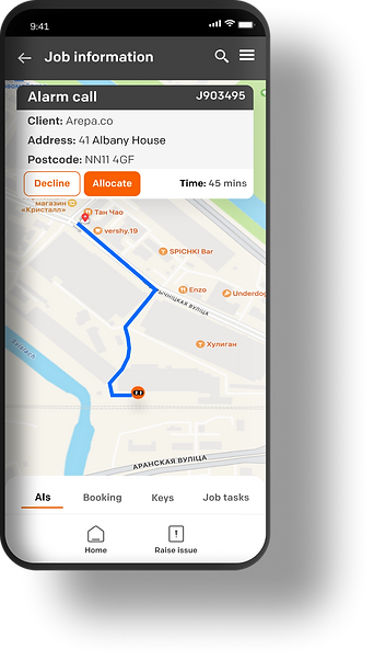
Proposal
-
Tap on the job card
-
View the map with the route displayed and job details of the job remain visible
-
View the estimated time to help access if the job can be taken
-
CTAs to accept or decline
The proposed solution reduce mental load and reduce the number of actions from the officer.
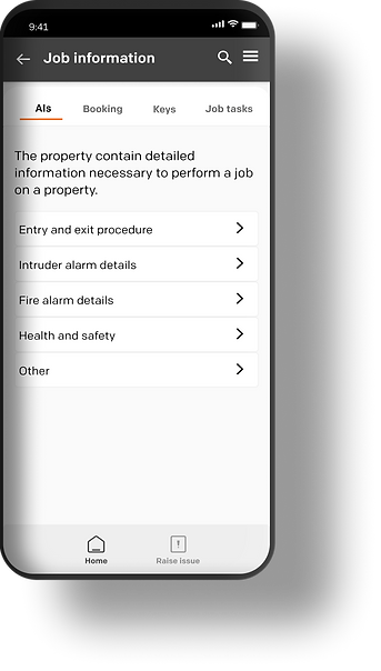
Job Details
Scenario
When an Officer selects a job card, he is presented with a list of options that allows him to find out information in more detail about the job and the property they have to visit.
Currently
-
A list is displayed however the list has a 3 levels navigation making very confusing for the officer to remember where things are specially during the job
-
Custom components are created which break consistency across the app
-
Navigation only displays once a job is accepted
Proposal
-
Remove 3rd level navigation, by changing the component to a tab and bring it closer to what it was previously. this will help reduce mental load as the officers were familiar with the previous chase 1 app. At the moment the officers have built a blocker and resistance to use the new app Chase 2 due to its sudden changes on the UX and UI
-
Simplify UI components such as list
-
Enable visibility of all the job details to help the Officer start the job and plan.


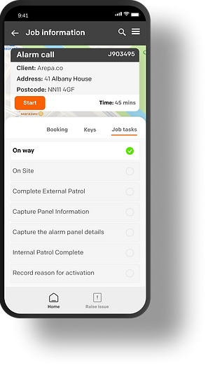
Job acceptance
Currently
-
Once the officer has all the details an d then the job gets accepted and its status changes based on the progress made
Proposed
-
Define the job live cycle, by identifying the different stages of the job and users that interact with it. This will help understand the entire flow and simplify or identify the areas that need attention. (This work is a separate project)
-
Once the officer has all the details then the job gets accepted and its status changes based on the progress made.
-
When a job is accepted, timers are set, the Job task screen will be displayed ready for the officer to start executing them.
Prototyping
Job acceptance
Scenario
An alarm has been detected, this sets a trigger to our security system and job created and enters our KTC software.
The job then is allocated the operation's dashboard who then allocate it to the relevant network partner. The job then gets triaged and allocated to an officer.
Define MVP and feature prioritisation
Together with the tech, testing teams we run a number of sessions to ensure the work was visible and planned so we can estimate the length and highlight the blockers / areas that had some cross dependencies.

Development
-
I run multiple demos with developers to make sure we were all aligned using incision prototypes
-
I handed over pixel-perfect and documentation to ensure i support the developers had as much as information as needed
-
Worked closely with the development team to ensure every progress made was aligned with the design and overall solution
Feedback
As part of the project tracking needed to be set up so we could have visibility of the system:
-
App adoption
-
Number of jobs accepted by the officer
-
Number of jobs completed
-
Number of steps to a task
Qualitative
-
Easiness of use
-
Quality of the job report
Reflection and key takeaways
-
Vision having a north start and consistently aligning the is really important, it creates reassurance, direction and believe eventually we all going towards a better place. this ensures all the teams speak the same language and more important understand the why we are here and where we are going.
-
Design thinking and culture are key to effective digital products. it can be challenging when there is a skill gap and strong fixed opinions with no understanding of the basics on product design, this creates a friction on ideas and ways of working as well as set uncertainty on the vision and strategy of the products as everyone is not aligned.
-
The best designs come from collaboration. It was great to see Officers wanting to be part of the solution. There is still a big gap between design and the rest of the company and we designers need to keep highlighting the importance of becoming user-centred design but also protecting the process and space needed to develop ideas/solutions to a given challenge together.